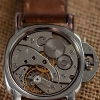
irate03 0 Posted June 13, 2018 I've been wanting to do one of these for a long time, I've been out of the game for a while too so digging out some tools was interesting. The base is a perfect clones 1655 just with an asian movement for now, this was always going to be a budget build and if I found I liked the way it worked and felt on the wrist I would in time upgrade the movement to something older. So the 1655 neat and pristine arrived and after wearing it for a very short while I took it apart Straight off I have noticed a few things, there were quite a few variations of the 1655 over the years it was around, various bezel fonts/sizes/thickness's, various dials with font, SWISS and coronet variations, some varying hand designs too. So I'm going for the best options I can get hold of. I also ordered a Tiger Concept 1655 which I will pick up in the next day or so, I think from pictures i've seen that it may provide the best GMT and hour hand out of what I have so far. I also bought a set of hands and GMT from raffles. The Raffles GMT looks a nice faded orange but on arrival I realised the shaft seems a bit too thin compared to my reference pictures. The seconds hand looks great. This will replace the stock seconds hand which is clearly wrong in so many ways. The Raffles hour and minute were a disappointment but this was a mistake on my part. There are two types for asian clone and two types for ETA and I got the hands that for some reason have a longer lume strip running across in to the black area of the hands. back to the stock hands, the Perfect Clones hour hand is too long, only slightly but I'm hoping the Tiger version will look better. I'm sticking with the stock crown at the moment as it looks pretty good, I will test water resistance with the stock crown, it would be nice to have a waterproof watch for a change. My biggest worry was with the lume indices on the stock dial. I saw lots of examples showing the outer indices sitting too far away from the rehaut. Thankfully the Perfect clones dial looks great. stock GMT and more faded Raffles GMT The dial has now had a light white wash which has given a slightly faded more matt look and I have stained the lume with a mixture of watered down fiebings water based leather dye. This has worked nicely, I didn't want supper orange tanned indices but subtle creamy patina and reluming would make the indices too puffy. It's starting to look better already. Today the Tiger Concept 1655 I ordered arrived I had a feeling it would offer better hands and after seeing the Raffles GMT shaft was a bit thin I hoped the Tiger GMT would be my better option. Here's what I see, The case is a fairly raw shape, the crown guards are very shaped but look like more of a sub build option. The plexi has no cyclops and is the wrong shape. The bezel has nice engravings but the shape is all wrong (see the side profile pic) The hour and minute are better dimensions and I think the GMT is the best of teh bunch I now have. The seconds hand is ok but I think I'm going to go for the raffles seconds. Tiger bezel profile and CG shape below Perfect clones bezel profile and CG shape below Hour hands left to right Tiger, Raffles (the 'custom') and Perfect Clones Seconds hands left to right Tiger, Raffles and Perfect Clones GMT hands left to right Tiger, Raffles and Perfect Clones Minute hands left to right Tiger, Raffles ('custom version') and Perfect Clones Share this post Link to post Share on other sites
irate03 0 Posted June 13, 2018 case shaping Another little update, I've actually had some time today to really get stuck in to this so..... Case reshaped and polished with subtle ageing. Hands lumed, the GMT and seconds are slightly warmer just because I saw a few ref. pics that had these hands more aged for some reason and I liked the look Oh and I lightly stained the date wheel to add some patina but only very subtle. Older models had a silver date wheel, maybe this will be a future upgrade along with a "flat four" bezel and more gen like plexi with a more magnified cyclops. Share this post Link to post Share on other sites
NCRich 13,747 Posted June 13, 2018 Neat! Nice work so far mate. Love the comparisons. Share this post Link to post Share on other sites
FunnyStarSystem 7,538 Posted June 13, 2018 Wow, that is sharp! This is my favorite Rolex, it just says tool watch, there's no pretentiousness. I also have the Steinhart homage which is a job well done. Rock on irate Share this post Link to post Share on other sites
bobandshawn 5 Posted June 13, 2018 Great details...nice job! Thanks. Share this post Link to post Share on other sites
RussP 22,228 Posted June 13, 2018 Great stuff. Wish I was half as competent as half the modders on this forum. Thanks for sharing. Share this post Link to post Share on other sites
BM284 1,518 Posted June 13, 2018 That looks amazing - love this! Share this post Link to post Share on other sites
eswilly 0 Posted June 13, 2018 Wowzerz. Beauty!Sent from my iPhone using Tapatalk Share this post Link to post Share on other sites
Nikosaldente 630 Posted June 13, 2018 Awesome work! I love DIYs! Share this post Link to post Share on other sites
J!m 289 Posted June 13, 2018 (edited) I'm really liking your "special sauce" to age the lume. Lume that is "yellow" or "brown" is often due to water ingress- not a natural ageing process. (I see a lot of "modded" dials here that take things WAY too far in my opinion) My blue 9411 dial actually got WHITER as I was wearing it, as the sun bleached out the darkening it obtained in storage for several decades... I strongly suggest swapping a gen crown and tube on. These small crowns are not very expensive (much less than 7mm crowns), and will not only round out your case work nicely, but also add function, durability and a much more water-tight solution. And back to the dial... The thing that JUMPS out at me is the "SWISS T<25" at the bottom. Wrong font and far too large, as I'm sure you already realize . You are obsessing over the hands (justifiably) but that text/font detail is what I see every time I look at your dial. (no offense intended!) PS What exact leather dye color are you using? I found alcohol based fiebings leather dye but not water based. And it is in several colors... Edited June 13, 2018 by J!m 1 Share this post Link to post Share on other sites
irate03 0 Posted June 13, 2018 59 minutes ago, J!m said: I'm really liking your "special sauce" to age the lume. Lume that is "yellow" or "brown" is often due to water ingress- not a natural ageing process. (I see a lot of "modded" dials here that take things WAY too far in my opinion) My blue 9411 dial actually got WHITER as I was wearing it, as the sun bleached out the darkening it obtained in storage for several decades... I strongly suggest swapping a gen crown and tube on. These small crowns are not very expensive (much less than 7mm crowns), and will not only round out your case work nicely, but also add function, durability and a much more water-tight solution. And back to the dial... The thing that JUMPS out at me is the "SWISS T<25" at the bottom. Wrong font and far too large, as I'm sure you already realize . You are obsessing over the hands (justifiably) but that text/font detail is what I see every time I look at your dial. (no offense intended!) PS What exact leather dye color are you using? I found alcohol based fiebings leather dye but not water based. And it is in several colors... Thanks for ALL the comments. Yes I would love to spend more on a dial but that wasn't the plan originally. I wanted to get the 1655 to see if I liked the size as most of my watches are now 34mm Oyster builds or 36/37mm gens. I wasn't planning on reshaping but staring at endless vintage pictures pushed me to it. I looked at gen 6mm crowns and that was something I was considering but to be honest the stock crown is actually quite good. I have a gen datejust and the crown is close enough for now anyway. Plus although I haven't given it a pressure test I know at least the case and crown keep the watch waterproof. For me the mail upgrades (probably sooner than later) will be a better bezel and also a better plexi with stronger cyclops. A better dial would be great but we're talking a good few hundred dollars or more at least. You know me, I always love a little photoshoot when I finish (for now) a build. Share this post Link to post Share on other sites
BM284 1,518 Posted June 13, 2018 Absolutely top draw! Love it! Share this post Link to post Share on other sites
Glaude 1,615 Posted June 13, 2018 Lovely pics, great work, awesome post ! Thanks for sharing all your work ! Enjoy this piece ! Share this post Link to post Share on other sites
semperfi55 4,707 Posted June 14, 2018 Thanks for sharing your brilliant work process! And lovely gallery of pics too Never really looked at the Explorer II yet but this has definitely caught my eye! Another watch to look at! Share this post Link to post Share on other sites
Xpletiv 16 Posted June 14, 2018 Holy snit, nice job all around, but, for me, especially with the bracelet aging! The sides look really convincing. Share this post Link to post Share on other sites
Bash64 17 Posted June 14, 2018 I love these posts! Great process and comparison shots. You have an eye for detail and I really like the subtle approach to achieve a legitimate vintage look. Well done!! Share this post Link to post Share on other sites
nuvolablue 2,051 Posted June 15, 2018 Fantastic build! These really one of the coolest of the vintage Rolies. Love mine to bits. I can recommend experimenting with different strap options for your additional pleasure of this watch. Sent from my SM-G930F using Tapatalk Share this post Link to post Share on other sites
gmchris 68 Posted June 15, 2018 Lovely build, I have way way too little patience for such perfection but it's proper talented stuff. In the interests of comparisons so people can gauge the difference, here is my 1655 which I have aged with *ahem* Costa Coffee Took 10 mins. I'd love to see a tutorial on vintaging a case, I'm too scared to try it Share this post Link to post Share on other sites
irate03 0 Posted June 17, 2018 I'll explain the "vintageing" of the bracelet. I placed the Perfect Clones bracelet in to a plastic sealed sandwich back along with a handful of smooth pebble gravel used to decorate the top soil of plant pots, nothing to sharp or rough. I also added a few ceramic beads used to lay on top of pie tops when baking, they have a matt smooth surface and are quite heavy. then I placed the bag in to a fabric bag and popped in to my tuble dryer on a cold/low heat for about 20 minutes. The bracelet came out lightly dinged and buffed and scratched, then I used a low abrasive wool attachment on my dremel to buff back some of the texture but only lightly, then rubbed over with metal polish by hand and then with a polishing attachment on my dremel i lightly polished up edges and corners, then one last wipe over with metal polish and wash down. the more times you repeat very light ageing processes the more natural it will look. if you just take sandpaper or wire wool to a bracelet or case it will just look wrong. Share this post Link to post Share on other sites
JimboJames1972 0 Posted June 18, 2018 That looks like a great build! Not only do you now have a very sharp looking watch to wear, but you also get the satisfaction of a job well done. Comgrats! Share this post Link to post Share on other sites
irate03 0 Posted December 4, 2018 a little update, I reworked the crown guards and found a nicer shape, I also lightly relumed the dial but I need to get better shots to show that off. Share this post Link to post Share on other sites
bobandshawn 5 Posted December 4, 2018 OK, time to move on to the next project. PM me when this goes to sale... Share this post Link to post Share on other sites